Modern Wedding Stationery with Bold Soul & Playful Energy: Krysta & Cam’s Celebration
When The Fior Collective reached out to collaborate on stationery for Krysta and Cam’s wedding, the brief was clear: bold, modern, and full of personality. Their day was a vibrant celebration of love and style—elevated yet joyfully relaxed—and their stationery suite needed to reflect that perfectly.
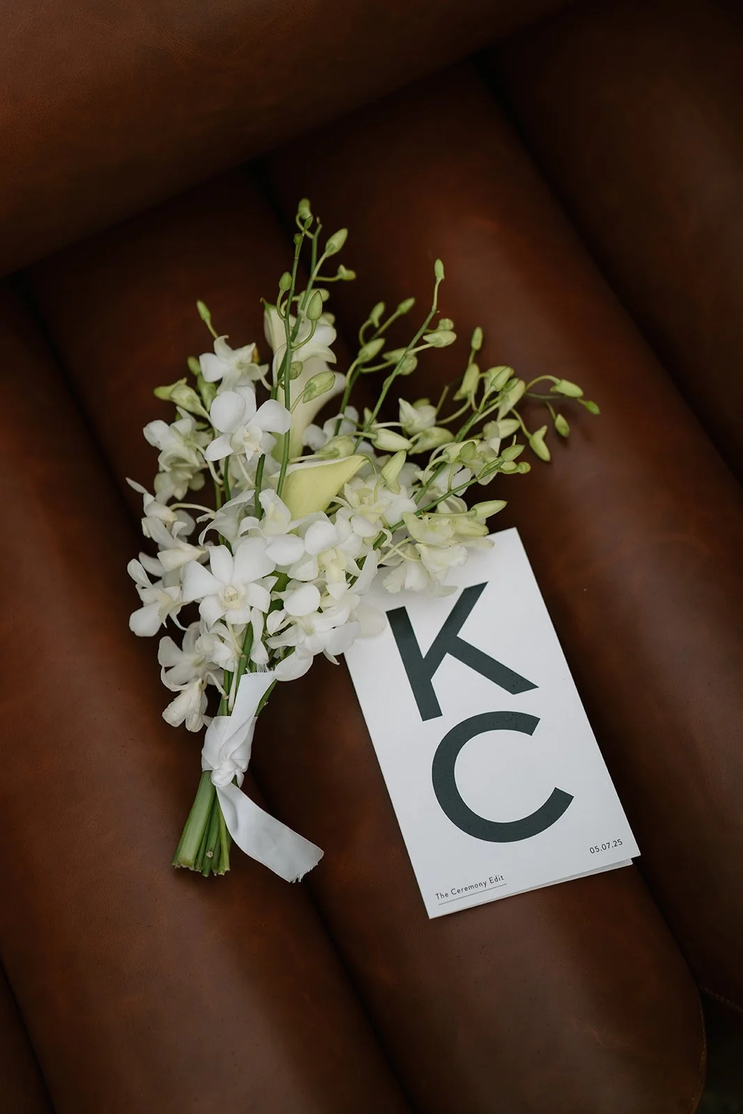
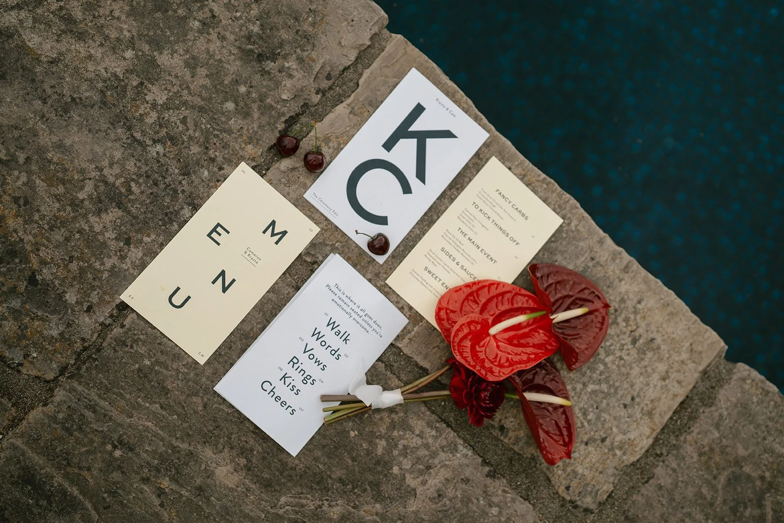
From the start, we leaned into a playful but refined design aesthetic, combining clean typography, dynamic layouts, and unexpected formatting to set the tone for their event. The result? A curated collection of menus, signage, and printed details that felt editorial, intentional, and completely “them.”
Eye-Catching Design with Purpose
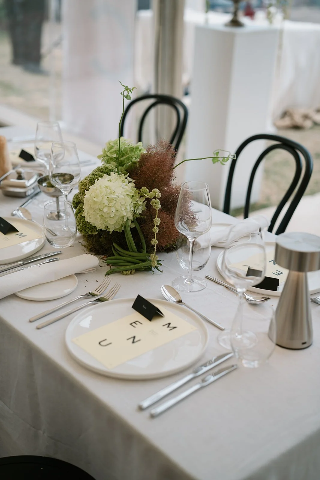
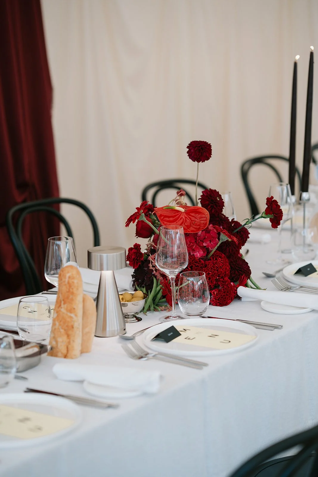
Each piece in the suite was crafted with a minimalist but memorable approach. The vertical MENU design—where each letter stands boldly alone—became a graphic centrepiece at each place setting. It was more than functional; it was a conversation starter. Paired with sleek black place cards and crisp white plates, the design made a striking statement against the elegant tablescape.
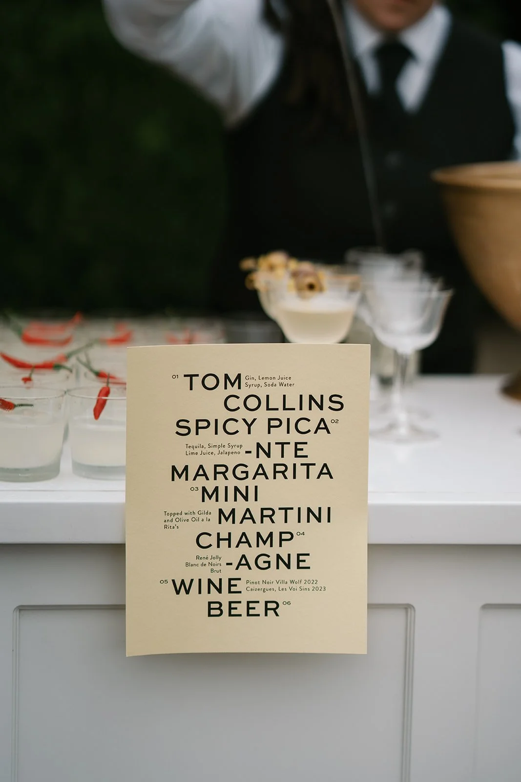
The drinks menu, displayed proudly at the bar, featured an artistic type layout with names and ingredients dancing across the page. It drew guests in with its quirky rhythm, encouraging exploration of the bespoke cocktails on offer—from spicy margaritas to classic martinis.
A Suite That Worked Hard
Every element had a role. The program card succinctly outlined the flow of the day with just six cheeky words: “Walk, Words, Vows, Rings, Kiss, Cheers.” Simple. Memorable. Perfect. The seating chart embraced warm terracotta tones to stand out against lush florals, while table numbers and menu cards were kept understated to balance the bolder elements.
Tactile Beauty
We printed on soft-touch stock with a subtle grain, adding a tactile dimension that elevated each piece. The creamy ivory tones and deep black ink gave everything a sophisticated finish that photographed beautifully but felt even better in hand.
Cohesion Without Conformity
What made this suite so successful was its balance: structured but not stiff, modern but not sterile. We played with hierarchy, negative space, and non-linear layouts to create visual interest while ensuring the experience remained intuitive for guests.
This wasn’t just stationery—it was an extension of Krysta & Cam’s story. A confident, clean, and vibrant collection designed to celebrate joy and detail in equal measure.
Planning a bold, modern celebration?
Let’s design something you’ll want to frame forever. Enquire about your wedding invitations here
Suppliers


