Neutral wedding invitations are the perfect canvas for modern couples who want their stationery to feel like an extension of their story, not a passing trend. These tones suit every aesthetic, from contemporary minimalism to old-world elegance. With the right details—embossed monograms, hand-torn edges, or a delicate vellum overlay—neutrals transcend simplicity and become unforgettable.
When creating a neutral invitation suite, the beauty lies in the details:
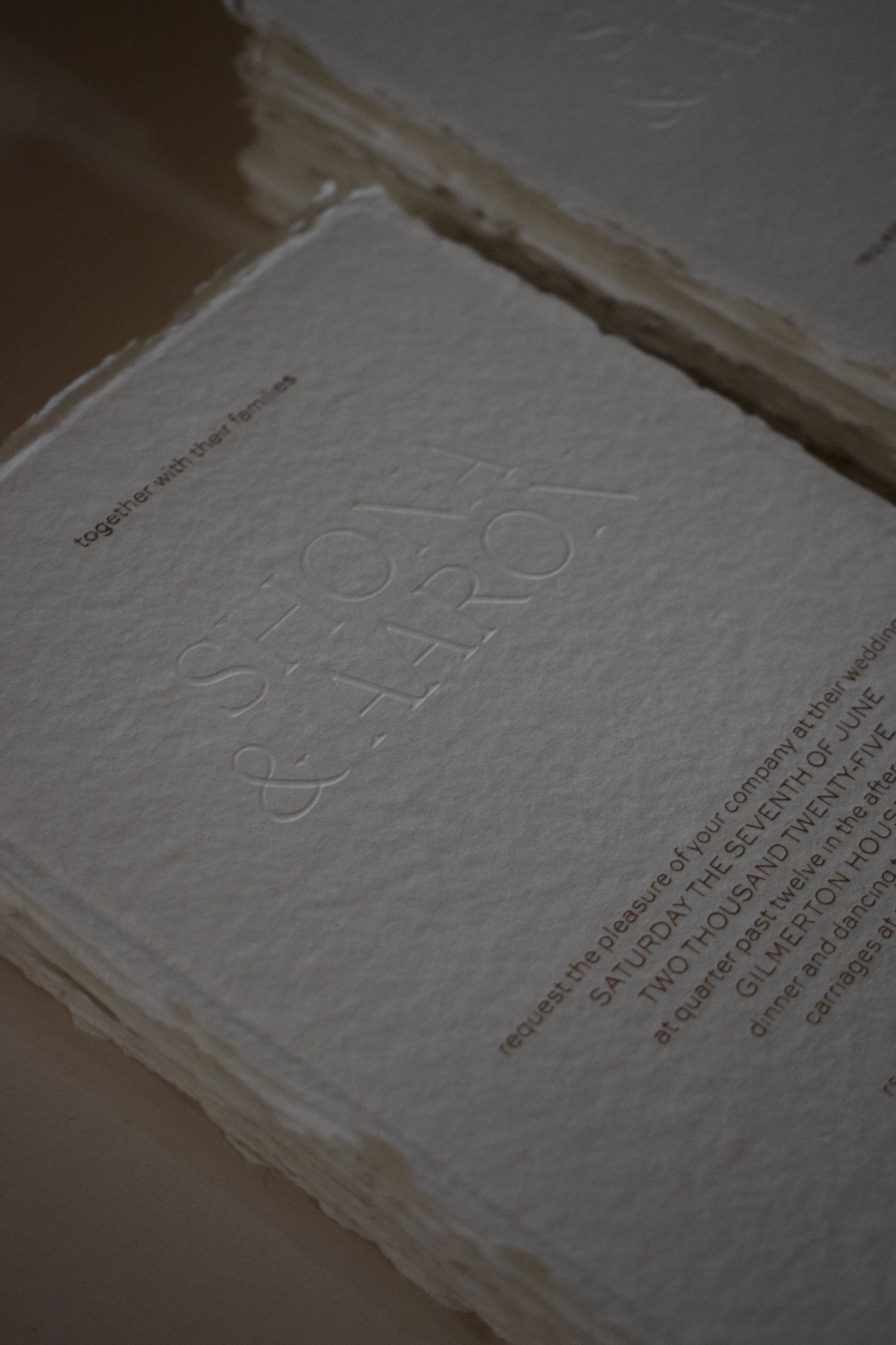
TEXTURE AS A DESIGN ELEMENT
Think letterpress on pillowy cotton stock, the soft shimmer of handmade paper, or the unexpected contrast of a matte finish paired with a high-gloss wax seal.
TYPE AS ART
Choose typography with intention. A classic serif paired with modern sans, or elegant script used sparingly, can add depth without overpowering.
MONOCHROMATIC LAYERS
Neutral doesn’t mean dull. Layers of similar tones—ecru envelopes, sand inserts, parchment RSVP cards—create dimension while remaining cohesive.
SUBTLE PERSONALISATION
Consider blind embossing your initials, or adding a painted edge in a complementary tone for a whisper of personality.